Project
MachE Task Force
A small hand-selected group within Ford Design Studio was tasked with redesigning the first OTA update for the MachE. This involved a complete overhaul of the UX/UI, including a fresh design system and simplification of the system. The team wanted to lean into the Mustang brand and allow the driver to engage with the driving modes the MachE offers.
Goals:
Give customers an exciting and simplified human-machine interface (HMI) experience in the first large OTA pushUtilize the physical knob located on the screen
Utilize the physical knob located on the screen
Simplify Climate System
Making driving modes exciting and discoverable, leaning into the Mustang brand
Build app bar/drawer for easy access to a wide range of applications
The Process
step 1:
Immersion
Tested every major BEV UI to get inspired and understand landscape and industry standards. The team rented 20+ vehicles to test in-person and got behind the wheel and interacted with screens, taking notes and seeing what worked as well as finding areas that need polish.
step 2:
Synthesis
We used BlueSpace, an online whiteboarding platform to organize our thinking. Before wireframing we mapped out key user flows and areas we wanted to focus.
Step 3:
Wireframe
The team was split into small groups to tackle sections of the MachE HMI and cluster. I was first tasked with reimagining the climate system and interactions. This involved first working with the hardware team to understand limitations of system and then creating user journies to improve core functions. We first built very simple wireframes and then used a slightly higher fidelity design system to prove out use cases and share for reviews with customers and product owners.
Step 4:
Design System
The team worked with an external agency to build a design system that would function as a foundation for the build. This included everything from new buttons to a complete color palette and even a newly-designed font specifically for the digital landscape.
step 5:
The Build
With a completed design system, the team could now take our wireframes and bring them to life. Each group was tasked with implementing rough wireframes into production-ready files. We would have 2 design reviews every week and push to a live prototype. We would have “design jam sessions” in Figma and have an open work environment where everyone could freely contribute and edits files together in real-time to work quickly.
One of the biggest wins for me personally was getting Ford to shift from Sketch to Figma! The entire design studio is now shifting and allowing for team members to collaboratively work together from all over the world.
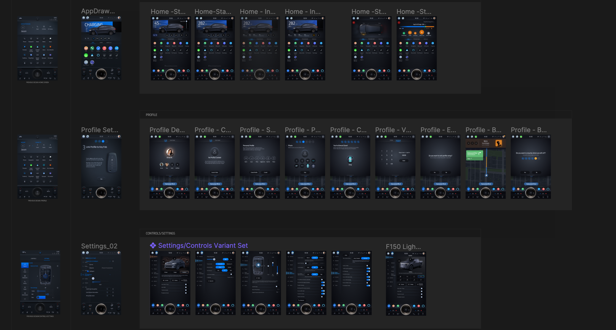
Highlighted below are 4 sections I worked on: Climate, Drive modes, Home Screen, Settings
Climate
Home Screen
Settings
Drive Modes
Step 6:
Prototyping
A primary goal of the project was to incorporate rapid prototyping with customers and product owners. We did this by using Figma to ProtoPie and ultimately getting the protype in the MachE for full emersion. The dev team was able to hook up CAN signals to our prototype to push our file to the vehicle for in-car testing, allowing the team to put the redesign in front of customers and executives for quick feedback. The team would use the feedback to do rapid iteration allowing for a more human-centered approach - the first time the design studio had attempted this approach. D-Ford was the catalyst for this.
Step 7:
Production Hand-Off
After user testing, executive reviews, and product owner approval each designer was responsible for overseeing the hand-off of working files to the production team to begin to implement in the release build. File structure and annotations were documented for a quick and easy build - a 4-month engineering effort after files are shared.


